

I am so pleased to share You + Me + Us, a new quilt I designed for Scraps, Inc., Vol. 2 from Lucky Spool Media. This is the second book in the Scraps, Inc. series and they are both full of such wonderful quilts. I want to make every single one—from both books. Volume 2 has 15 quilt projects, each from a different designer. The projects are fresh and new, and anyone who has quilted for even a short while knows how great it is to find projects you love that make use of those precious scraps that accumulate. The photography from Nydia Kehnle is gorgeous. I had the unique privilege of not only contributing a quilt design, I also did the assembly illustrations and page layout. It was a labor of love and I'm so grateful to Lucky Spool.

In addition to making great use of scrap strips, this quilt has extra meaning to me. It is a bed quilt and represents the intertwining of the two lives of a couple, sort of a modern-day version of a wedding quilt. It's also a fun one to put together. I pulled scraps from all kinds of projects for a colorful, bohemian assortment. It's kind of like life, with all sorts of bits and pieces held together and made into a beautiful whole.


The quilt even has a scrappy binding!
Discount!
For a limited time, you can order this book from Taunton for 30% off using the code Scraps30. The discount is good through Tuesday, February 16th.Giveaway!-----Closed!
I also have a copy to give away! I'll draw a winner on February 14 to give someone a nice Valentine's Day present! To be entered, please leave a comment telling me about one of your favorite fabrics to use for a background.More Gorgeous Inspiration!
You really have to check out the other quilters on this blog hop if you haven't already. Their quilts are gorgeous! I have a hard time picking which one is my favorite.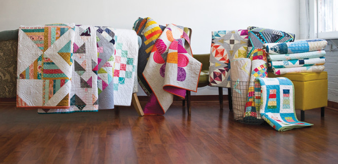
Monday, February 8
Amy Smart, Diary of a Quilter
Nydia Kehnle, Nydia Kehnle Design + Photography
Tuesday, February 9
Amy Friend, During Quiet Time
Alexandra Ledgerwood, Teaginny Designs
Wednesday, February 10
April Rosenthal, April Rosenthal - The {Studio} Blog
Dorie Schwarz, Tumbling Blocks
Thursday, February 11
Erin Harris, House on Hill Road
Janice Ryan, Better Off Thread
Friday, February 12
John Adams, Quilt Dad
Kari Vojtechovsky, that's me!
Saturday, February 13
Katie Blakesley, Swim Bike Quilt
Kati Spencer, From the Blue Chair
Sunday, February 14
Melissa Lunden, Lunden Designs
Allison Harris, Cluck Cluck Sew
Sherri McConnell, A Quilting Life
63 comments :
Congratulations on the book. I have used flannel in the past and really love the cuddly results!
I love using the Botanics trees in white as a background fabric because it looks white but it's not and it added extra print that was not overwhelming to the quilt.
Ooh, I love the concept of your quilt. I've been making and dreaming of designs with solid navy backgrounds these days.
I love the dark gray you used as a background on this quilt. It really helps the colors pop. I usually use white backgrounds but want to get a bit braver and try some darker solids. This quilt really inspires me to try!
I love to use black or a silver grey. Your quilt is gorgeous. The book looks great.
I like to use some color of grunge or low volume text print as background. Thank you for sharing this project.
This looks like a wonderful book. Thanks for the chance to win a copy. I like using light greys for background fabric but am planning to venture into a dark background like a navy on my next quilt. Love the background you used.
I have often used white, but I also really like grays! I need to try some chambray like you used here soon! It looks awesome, and I love the way your quilt turned out!
Really love this quilt. Great use of scraps, balanced with solids for a clean modern pattern. Very striking!
I seem to be in to steel gray solid backgrounds lately for my bigger projected. It lets the main fabrics stand out & shine.
I love using essex yarn dyed linen. It goes with everything and anything.
I have used a lot of black as backgrounds but recently I've switched to navy. It's a little less stark and just appeals to me but I haven't completely deserted my blacks.
I love your grey backround
kona coal is usually my favorite neutral backround but, lately I have used parchment basic solid that I purchased from connecting threads and like that too
I have a small houndstooth chambray that would be perfect for this ! Very cool pattern
Love the book. I'm a new quilter, so I've only used a couple of neutrals for my backgrounds..
I LOVE your quilt! It is so unique and graphic. I can totally see myself making this.
I am quite boring when it comes to background fabric. Kona white is usually too white, Kona snow is too cream so I usually go with Kona unbleached PFD.
I need to branch out.....
:)
My new favorite solids are Micheal Miller Cotton Couture. They are sooooo soft and drappy.
I love peppered cottons and low volume prints. I love love this quilt. I want to make one for my bed.
I like Kona medium gray
Love the bright, cheery colors and the strips. What a great quilt. I use a lot of white and cream for background but I love to use color. I just finished a quilt with a teal background. Stunning. I get tired of being safe but when I'm giving the quilt away I tend to play it neutral.
I either like Bella White PFD or Architectures crosshatched in gray.
This was stunning to see in person--and it is equally so in the photos. I'm digging using really dark, saturated Kona solids as backgrounds right now.
Your quilt is so unique, love the visual play with it, and the colors are wonderful!
Very cool quilt, as for backgrounds my new interest has been shot cottons.They give such sheen and interest to a quilt.
Great quilt and story! I have a piece of a pale green Tula Pink fabric that I have been stashing, waiting for the perfect project... I seem to like grey solids for backgrounds, while I wait for the perfect use for Tula!
I love to use flannel on a baby quilt, so soft...otherwise it is just whatever I have on hand that will fit &/or i patchwork it to make it double sided!
Your quilt is my new favorite! I have never seen one like it & it's on my must make 2016 list. Beautiful!
Hmmm, I end up using white an awful lot of the time, but it's not really my favorite. I prefer a hint of print in my backgrounds!
Although I mainly use white for backgrounds I like a scrappy mixed background!
I'm so boring - I use white/off-white for almost all of my backgrounds. I love how it shows off the colors, and I love how I can snag bolts of it for really cheap on Black Friday.
Your quilt is striking. I may need to add this one to my long to-do list. I tend to like my background fabrics to have some texture such as the Moda Grunge fabrics and the shot/peppered cottons are great.
tushay3 (at) yahoo (dot) com
I'm a beginner quilter so the lighter background the better! ;)
I love using Essex linen for its added heaviness! Is that like chambray? I don't know but maybe! I also like a scrappy colored background :)
I think a navy grunge background makes a lot of colors pop. Scrappy low volume backgrounds are another favorite.
I love low volume text prints for backgrounds or Moda grunge if I need a darker background.
nkadenver at yahoo dot com
I use a white or an ash. I have to say that Kona Ash is probably my favorite.
Very nice quilt! This book looks terrific. I have the first edition and love it.
I like to use a low volume print or a soft pale gray as my background. It makes the vivid colors that I like to use stand out!
Kari, I really like your quilt! The colors, the design, and especially the meaning behind it--so romantic :) The chambray really sounds yummy, too. At the moment, I'm really taken by Essex linen-cotton for the background. Thanks so much for the giveaway.
I must be boring, but my favorite background color is Kona Snow. Pretty basic!
My favourite background solid is from the aqua colour range- it goes well with reds, pinks, greens and oranges! Love the look of this book! I have plenty of scraps that need making into beautiful quilts!
I LOVE your quilt - so much color and yet so comfy looking. I really like using solid backgrounds - but with texture. I'm loving the linen looking fabrics - just a tad bit of texture. Thanks for a chance to win a copy of this amazing book!
I have not been very creative with background fabrics, usually use white or gray. But, I love your chambray background! It is the perfect complement to the bold red and yellow in your quilt. I really like your unique design. Your description of it representing the intertwining of the two lives of a couple, sort of a modern-day version of a wedding quilt, fits it perfectly. Thanks for the inspiration and the chance to win the new book.
Congrats on being part of this book and making this fantastic quilt. I wanted to talk to you about it when you showed it at January's meeting but we got off on other things. Updating the concept of a wedding quilt and using scraps is really smart. Great choice on the chambray; it's become one of my personal favorites for background fabrics. It adds subtle texture and sheen to a quilt. I'm partial to medium to dark gray chambray, personally.
Your quilt is stunning! I use a lot of Kona or Bella in white or light grey, but every once in a while I have a project that screams for something bright like hot pink or ocean blue. I have a niggling thought in the back of my mind that I need to do a quilt with orange as the background.
I like to use for the most part a medium grey! Your quilt is awesome! thanks!
I tend towards lighter backgrounds to let the design show off. Not necessarily white or cream, but something that is of substantial contrast. But now you've really got me intrigued by your use of chambray here, so that will probably show up not too far down the road. Love your quilt and the fresh idea for a wedding quilt.
I like the use of prints which read like a solid for backgrounds. It adds texture and interest to the overall design!
I'm using a dark grey as a background (at my daughters request) on a quilt for her and it's beautiful!
Love the greys and, my favorite, aquas.
Hi Kari! Congrats on a beautiful contribution to the book. My favorite fabric to use as a background is a non-neutral- I am so over white and cream!
Lately, I have been using a navy Kona for a background. Your quilt is gorgeous!
I love using white as a background. I think all you designers did a wonderful job on this book, so many great patterns that are just begging me to use up some scraps on!!
Right now my favourite background fabric is Kona silver.
I love polka dots for backgrounds!
I love low volume scraps for background.
I tend to choose a light colour for backgrounds - soft white is my current fave.
Tiny small light prints. Haven't tried using a grey yet, gives a nice sparkle.
I like using gray as a background. I really think it makes the colors pop.
I haven't done a lot of quilting so I don't have a favorite background yet. I would say whatever seems to go with best with the design and other fabrics.
I love to use navy for the background. It really makes the colors pop!
I really like to use black as a background or as the sashing. It makes all the other colors stand out. vkh6210 at gmail dot com
My first quilt had a navy background and I have not been able to white. It is too white. Thank you for chance! Love your quilt!
What a brilliant design! Stands out from all the rest in the book, in my opinion. Love it! Your quilt is the reason I want to get the book now.
Hi Kari V, it's so nice to meet you and come upon your blog .
I've got to buy this book...love a chambray background (although I've never sewn or quilted with chambray or it's color) Your quilt is truly stunning and a novice like me is feeling your inspiration.
I know the giveaway is closed that's okay...I just had to let you know I love your pattern!!
bluestarof2(at)yahoo(dot)com
Post a Comment